Less offers you complete customization over the look and feel of your website’s borders and corner styles to help your create a consistent and branded design.
Navigate to Thesis → Design to get started.
In This Guide
Building your Primary Border
Border 1 is the foundation of your website’s border styling. The border builder comes with three settings to guide you to create your first border.
- Border Width: Set the thickness of the border in pixels.
- Border Style: Set the line pattern of the border.
- Default
- Solid
- Dotted
- Dashed
- Double
- Groove
- Ridge
- Inset
- Outset
- None
- Border Color: Set the color of the border.
After configuring these three options, you’ll have a Primary Border that you can easily apply it to various elements throughout your website.
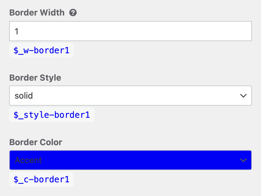
This border is 1 pixel thick, solid in style, and uses the Brand Accent color.
Default Design Options
| Option | Default | Variable |
|---|---|---|
| Border Width | 1 px | $_w-border1 |
| Border Style | Solid | $_style-border1 |
| Border Color | Accent | $_c-border1 |
Building additional borders
Border 2 and Border 3 are additional borders that add variety to your design. Just like your Primary Border, they can be customized independently, giving you the ability to define different border widths, styles, and colors.
Default Design Options
| Option | Default | Variable |
|---|---|---|
| Border 2 | — | — |
| Border Width | Empty | $_w-border2 |
| Border Style | Empty | $_style-border2 |
| Border Color | Empty | $_c-border2 |
| Border 3 | — | — |
| Border Width | Empty | $_w-border3 |
| Border Style | Empty | $_style-border3 |
| Border Color | Empty | $_c-border3 |
Building custom borders
While the border builder offers great flexibility, you might occasionally want to add a more custom touch. Keep in mind that this option is best suited for those comfortable with code.
When adding a border to an element, you can choose from the available options (Border 1, Border 2, Border 3) or include your own custom code. Simply select “Custom Border” from the dropdown menu and enter your desired code.
Examples of custom border styles:
- Simple shorthand CSS:
1px dotted #F5F5F52px solid rgba(0, 0, 0, 0.2)
- Complex style with hover and active states using variables:
-
$border1;
border-bottom-width: 4px;
&:hover,
&:focus {
    border-color: $c5;
}
&:active {
    border-bottom-width: 2px;
    margin-top: 2px;
}
-
Selecting your Primary Corner
Corner 1 serves as the Primary Corner style for most elements in your website design. Implemented through the CSS property ‘border-radius’, it allows you to create rounded corners on various elements without writing code.
- Most Round
- More Round
- Less Round
- Less Square
- More Square
- Most Square
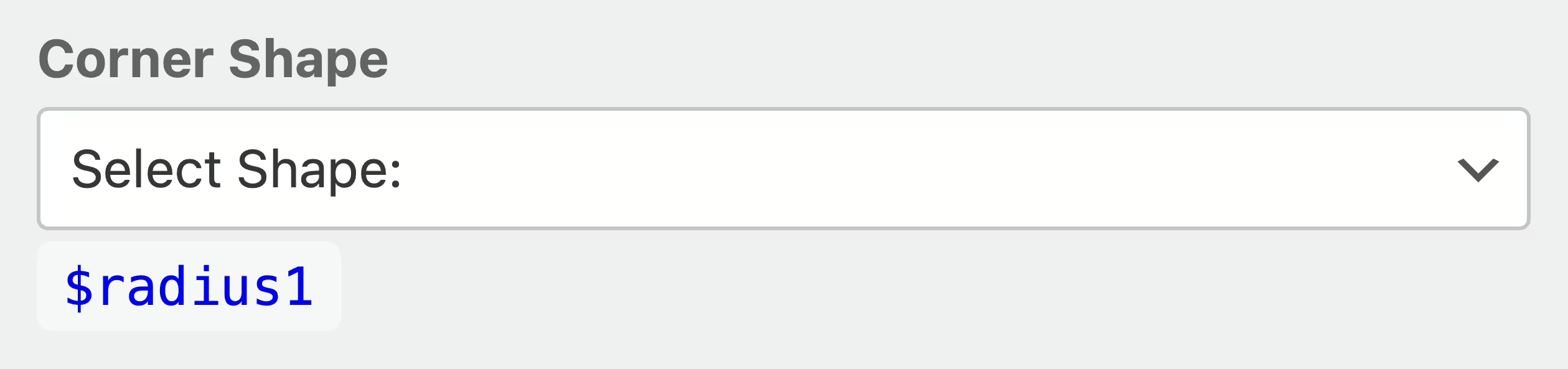
The Corner Shape dropdown menu offers a range of options, from Square (no applied shape) to fully round, allowing you to customize the corner style of your elements.
Default Design Options
| Option | Default | Variable |
|---|---|---|
| Corner Shape | Empty | $radius1 |
Selecting additional corners
Corner 2 and Corner 3 are additional corner shapes that add variety to your design. Just like your Primary Corner, they can be customized independently, giving you the ability to define different levels of roundness or sharpness.
Default Design Options
| Option | Default | Variable |
|---|---|---|
| Corner 2 | — | — |
| Corner Shape | Empty | $radius2 |
| Corner 3 | — | — |
| Corner Shape | Empty | $radius3 |
Using styles in your design
Once you’ve created your borders and selected your corners, you can easily apply them to design different elements of your website.
The Design Dashboard offers options to modify both Borders and Corners for various elements.
- Header
- Border Bottom Empty
- Banner
- Border Bottom Empty
- Bar Menu
- Border Bottom Empty
- Posts
- Border Between Posts Empty
- Bylines
- Border Top Empty
- Border Bottom Empty
- Pagination
- Border Top Empty
- Sequential Pagination
- Border Empty
- Corner Empty
- Numerical Pagination
- Border Empty
- Corner Empty
- Page Number Current
- Border Empty
- Descriptions
- Border Top Empty
- Avatars
- Corner Empty
- Footer
- Border Top Empty
- Buttons
- Corner Empty
- Buttons (Default)
- Border Empty
- Border Hovered Empty
- Buttons (Action)
- Border Inherit Default
- Border Hovered Inherit Default
- Buttons (Delete)
- Border Inherit Default
- Border Hovered Inherit Default
- Buttons (Save)
- Border Inherit Default
- Border Hovered Inherit Default
- Buttons (Update)
- Border Inherit Default
- Border Hovered Inherit Default
- Inputs(Texts)
- Border Border 1
- Corner Empty
- Inputs (Textareas)
- Border Inherit Default
- Corner Empty
- Inputs (Selects)
- Border Inherit Default
- Inputs (Submits)
- Border Inherit Default
- Border Hovered Inherit Default
- Corner Empty
- Badges
- Corner Empty
- Badges (Default)
- Border Empty
- Badges (Drop)
- Border Inherit Default
- Badges (Edit)
- Border Inherit Default
- Badges (Feat)
- Border Inherit Default
- Badges (Fix)
- Border Inherit Default
- Blockquotes
- Border Left Border 1
- Code (Inline Code)
- Border Empty
- Corner Empty
- Code (Keyboard Input)
- Border Custom
-
solid;
border-width: 1px 1px 2px 1px;
border-color: $ca
-
- Corner Empty
- Border Custom
- Code (Preformatted)
- Border Empty
- Corner Empty
- Callouts
- Corner Empty
- Callouts (Default)
- Border Empty
- Callouts (Alert)
- Border Inherit Default
- Callouts (Note)
- Border Inherit Default
- Callouts (Info)
- Border Inherit Default
- Callouts (Tip)
- Border Inherit Default
- Dividers
- Border Empty
- Footnotes
- Border Top Border 1
- Frames
- Border Border 1
- Tables
- Border Border 1
- Tables (Header)
- Border Bottom Empty
- Border Vertical Empty
- Tables (Body)
- Border Horizontal Empty
- Border Vertical Empty
- Tables (Footer)
- Border Top Border 1
- Border Vertical Empty
- Bars
- Border Empty
- Corner Empty
- Breakouts
- Border Empty
- Corner Empty
- Pullouts
- Border Empty
- Corner Empty
- Bleeds
- Border Top Empty
- Border Bottom Empty